Practicing Python Data Science
Data analysis is a skill that I'm proud of; much of my work in this arena over the last decade has been done using MATLAB in a professional setting. Seeing that a lot of compelling and accessible tools are developing in the Python community I looked for an opportunity to practice methods I was familiar with in the MATLAB but instead using Python.
Data available in reference 1 and associated with the paper in reference 2 on power utilization in Tetouan, Morocco seemed like a good opportunity to try out various timeseries analysis techniques as well as some machine learning concepts and a variety of visualization techniques. Packages I used included:
The data analyzed consists of timeseries of power utilization in three zones in the city along with possibly causal variables including temperature, humidity, wind speed, and a couple variations on solar radiation. The starting point of the analysis was a heatmap of the correlation matrix among the variables (My wife remarked "it looks like a quilt"):
As expected the power dissipation of the three zones in the city and are reasonably positively correlated and power dissipation was also somewhat correlated to temperature. The time history of the windspeed variable looked questionable and it is possible that there were limitations for that instrument that I'm unaware of, but windspeed was somewhat correlated to temperature. In my experience with desert climates of the Southwest United States is similar to this with winds tending to pick up as solar heating warms the surface. I did not quickly find a good description of "Generalized Diffuse Flows" and "Diffuse Flows" but the former clearly looked like the solar radiation diurnal cycle typical of desert regions (Reference (3)). This variable was also reasonably correlated to temperature.
FFT Analysis
Next was some FFT analysis. Clearly expected cycles included daily, weekly and annual cycles. The amplitude spectrum of the available variable is shown in Figure 2:
The expected daily peaks are clearly present in all variables except for wind speed as shown in Figure 3. Harmonics of the daily cycle also appear reflecting the non-sinusoidal shape of the various waveforms.
A sub-harmonic at a frequency of 1/(7days) shows up in two of the three zones as shown in Figure 4, this may reflect different usages of zone 3 compared to zones 1 and 2, for instance industrial versus residential usage.
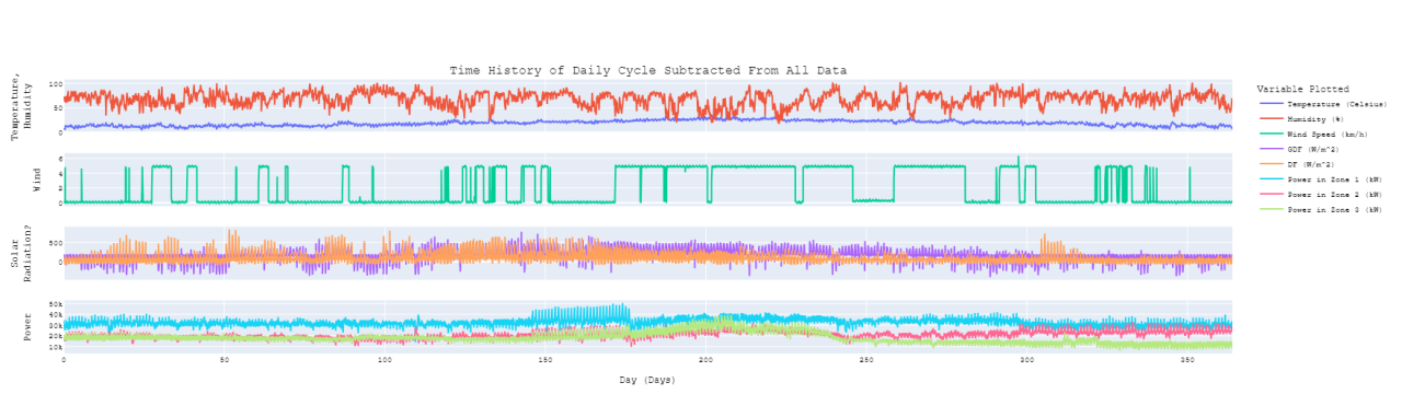
The FFT results also allowed creation of an average daily cycle by inverse transforming components with daily cycles and harmonics thereof. Subtracting this daily cycle off of the time history data creates some interesting results (Figure 5). There is a decided change in the time history of power utilization from day 146 to 176. All three zones show this trend, but the most pronounced difference shows up in zone 1 (Figure 6). The source country for this data is 99% Muslim (Reference 4) and Ramadan in 2017 was the evening of Fri, May 26, 2017 through the evening of Sat, Jun 24, 2017, corresponding to days 146 through 175.
Statistical Analysis
Moving on from FFT analysis I conducted some statistical visualization of the data beginning with a PairPlot (Figure 7).
Recommended by LinkedIn
Bivariate Kernel Density Estimates (KDE) are plotted below the diagonal, univariate KDE on the diagonal and actual data points above the diagonal. Separating the data by quarter-year was an easy approximation to separating it by season as the "Quarters" presented here start 1 December instead of 1 January; the color coding is intended to be intuitive with blue being approximately winter, green spring, red summer, and orange fall. The temperature shifts predictably through seasons, and the tail of Zone 3 power (P3) also shifts right during summer but the other two shift somewhat less. This plot provides other insights above what can be learned from Figure 1:
SVD/PCA Analysis
The next step was some SVD/PCA analysis. The reasonably small number of variables involved in this data set may not really make dimensionality reduction necessary, but it was suitable for test driving the tools available in NumPy. Starting with an SVD decomposition of the three power zones resulted in a Sigma matrix plotted in Figure 8
The first principal component accounts for 87% of the variance in the data set so the power data could reasonably be collapsed to a single variable for some applications. Looking at this concept more closely Figure 9 shows the error associated with using a rank-1 approximation to the three power zones:
The performance of this approximation for zone 1 and 2 might be acceptable for some purposes, but the performance for zone 3 would unlikely be acceptable for any purpose unless the focus was the first half of the year.
When expanding the SVD analysis to all variables it was necessary to normalize them as they represent different physical parameters with different numerical ranges. Each signal was normalized to zero-mean and unit standard deviation before performing the SVD transformation. Figure 10 shows the relative importance of the decomposition components and illustrates that not much dimensionality reduction across the full data set is feasible:
A rank 3 approximation was tried and for some variables and in some timeframes it matched general trends, but it also provided some significant misses. Since all variable were normalized to have the same amount of variance (unit standard deviation) it may make more sense to eliminate variables with obvious problems from this process. The most obvious choice being the wind sensor. Another possible choice is the variable labeled "DF" as this looks like a solar-radiation variable with all of the mid-day data zeroed out. Table 1 shows how the RSS errors are reduced by this approach for all variables except for GDF
Conclusions
The main objective of this work was learning how to implement techniques I'm familiar with in the MATLAB environment using the tools available in Python. With a reasonable understanding of the objectives of the various analyses I found the process reasonably easy although there are terminology differences and a certain amount of IT overhead in using the Python environment.
References:


I've recently created a gitHub account and uploaded the analysis code there. While I'm getting accustomed to gitHub I've decided to keep the project private, but would be happy to share it with my connections if anyone is interested.
Dave, this is a nice write up. I've played around with both languages at different times, but I find this a great synopsis of how much overlap can be found in the base capabilities.
Nice Dave. I have been converting over too. Nice to have something free with so many libraries. Raspberry pi interface, opencv for vision processing and much more. It really is becoming an essential language at this point just to be part of the action
Curious, now that you can do this in Python and Matlab, did you learn pros/cons of both ways? Are you going to try it in R next? ; )
Hey Dave, a fun yet challenging read. Thanks!