Optimizing Ship Performance with Data Science: A Deep Dive
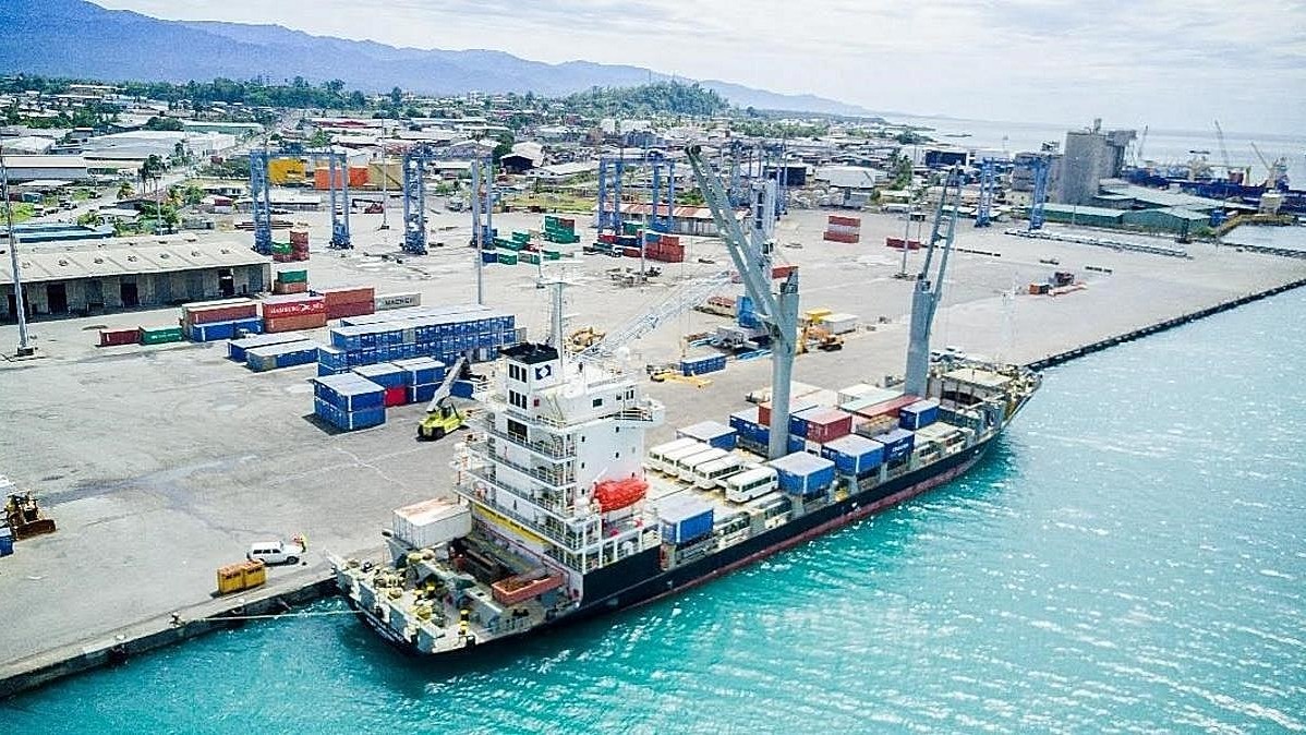
The maritime industry plays a crucial role in global trade, yet optimizing ship performance remains a challenge due to fuel efficiency concerns, operational costs, and maintenance requirements. Using data science techniques, we can extract valuable insights from ship performance data to drive better decision-making.
The Ship Performance Dataset
The dataset used in this analysis represents key operational metrics of various ship types operating in the Gulf of Guinea. It includes:
✅ Speed Over Ground ✅ Engine Power ✅ Cargo Weight ✅ Operational Cost ✅ Revenue per Voyage ✅ Weather Conditions & More
With 2,736 records and 18 features, this dataset provides an excellent foundation for exploring clustering techniques and optimization strategies in the maritime sector.
Step-by-Step Guide to Analyzing Ship Performance Data
Step 1: Importing Dependencies
To begin our analysis, we need to load the necessary Python libraries. These libraries help us with data manipulation, visualization, and machine learning.
import pandas as pd
import numpy as np
import matplotlib.pyplot as plt
import seaborn as sns
from sklearn.preprocessing import StandardScaler
from sklearn.decomposition import PCA
from sklearn.cluster import KMeans
from sklearn.metrics import silhouette_score
Step 2: Loading the Dataset
I import the dataset to understand its structure, including the number of rows, columns, and sample data.
df = pd.read_csv('Ship_Performance_Dataset.csv')
print(df.head())
print(f'Number of Rows: {df.shape[0]}')
print(f'Number of Columns: {df.shape[1]}')
Step 3: Data Wrangling
Before diving into analysis, we clean the dataset by standardizing column names, converting date columns, and checking for missing values.
df.columns = df.columns.str.lower()
df['date'] = pd.to_datetime(df['date'])
df.isnull().sum()
Step 4: Exploratory Data Analysis
Distribution of Numerical Features
EDA helps us understand the patterns and trends within our dataset. We visualize numerical data distributions to detect anomalies and variations.
plt.figure(figsize=(15, 12))
for i, col in enumerate(df.select_dtypes(include=['float64']).columns):
    plt.subplot(4, 3, i+1)
    sns.histplot(df[col], kde=True, bins=20)
    plt.title(f'Distribution of {col}')
plt.tight_layout()
plt.show()
Correlation Heatmap
A correlation heatmap helps us identify relationships between different numerical features, which is useful for feature selection.
plt.figure(figsize=(12, 9))
corr = df.corr()
sns.heatmap(corr, annot=True, fmt='.2f', cmap='coolwarm', square=True)
plt.title('Correlation Heatmap')
plt.show()
Count of Ship Types
plt.figure(figsize=(12, 4))
sns.countplot(x = 'ship_type', data = df, palette = 'Blues')
Count of Route Types
plt.figure(figsize=(12, 4))
sns.countplot(x = 'route_type', data = df, palette = 'Blues')
Count of Engine Types
plt.figure(figsize=(12, 4))
sns.countplot(x = 'engine_type', data = df, palette = 'Reds')
Count of Maintenance Status
plt.figure(figsize=(12, 4))
sns.countplot(x = 'maintenance_status', data = df, palette = 'inferno')
Average Operational Cost of each Engine type
# engine_type average operational_cost
engine_cost = df.groupby('engine_type')[['operational_cost_usd']].mean().round(2)
engine_cost = engine_cost.sort_values(by = 'operational_cost_usd', ascending = False)
engine_cost
# Set figure size
plt.figure(figsize=(12, 6))
# Create bar plot
sns.barplot(x = engine_cost.index, y = engine_cost['operational_cost_usd'], palette = 'Blues_r')
# Customize the plot
plt.xlabel("Engine Type", fontsize=12)
plt.ylabel("Average Operational Cost (USD)", fontsize=12)
plt.title("Average Operational Cost by Engine Type", fontsize=14)
plt.xticks(rotation = 90) # Rotate x-axis labels for readability
# Show the plot
plt.show()
Recommended by LinkedIn
Average Operational Cost of Over the months
# Set figure size
plt.figure(figsize=(12, 6))
# Create bar plot
sns.barplot(x = monthly_cost.index, y = monthly_cost['operational_cost_usd'], palette = 'Blues_r')
# Customize the plot
plt.xlabel("Month", fontsize=12)
plt.ylabel("Average Operational Cost (USD)", fontsize=12)
plt.title("Average Operational Cost by month", fontsize=14)
plt.xticks(rotation = 90) # Rotate x-axis labels for readability
# Show the plot
plt.show()
Daily Average Operational Cost
plt.figure(figsize=(12,6))
# Create an area plot
plt.plot(daily_cost.index, daily_cost['operational_cost_usd'], color = 'Blue')

# Labels and title
plt.xlabel("Day of the Month", fontsize = 12)
plt.ylabel("Average Operational Cost (USD)", fontsize=12)
plt.title("Daily Average Operational Cost (Area Plot)", fontsize=12)
plt.xticks(daily_cost.index)  # Show all days on x-axis

# Grid and legend
plt.grid(True, linestyle='--')
plt.legend()
Step 5: Clustering Analysis
Clustering is an unsupervised learning method that groups similar ships together based on performance metrics.
Standardizing the Data
To ensure that all features contribute equally to clustering, we standardize numerical values.
scaler = StandardScaler()
df_scaled = scaler.fit_transform(df.select_dtypes(include=['float64', 'int64']))
Applying PCA
Principal Component Analysis (PCA) reduces dimensionality while retaining essential information, making clustering more effective.
Why Use PCA?
When to Use PCA?
pca = PCA(n_components=2)
df_pca = pca.fit_transform(df_scaled)
Finding Optimal Clusters using Elbow Method
I determine the optimal number of clusters by plotting the Elbow Curve, which shows the point where adding clusters has diminishing returns.
inertia = []
cluster_range = range(2, 11)
for k in cluster_range:
    kmeans = KMeans(n_clusters=k, random_state=42)
    kmeans.fit(df_scaled)
    inertia.append(kmeans.inertia_)
plt.figure(figsize=(8, 5))
plt.plot(cluster_range, inertia, marker='o')
plt.title('Elbow Method For Optimal k')
plt.xlabel('Number of clusters (k)')
plt.ylabel('Inertia')
plt.xticks(cluster_range)
plt.show()
K-Means Clustering
After determining the optimal number of clusters, I apply K-Means clustering and evaluate its effectiveness using the Silhouette Score.
kmeans = KMeans(n_clusters=5, random_state=42)
kmeans_labels = kmeans.fit_predict(df_pca)
kmeans_score = silhouette_score(df_pca, kmeans_labels)
print(f'K-Means Score: {kmeans_score:.2f}')
# K-Means Clustering
plt.figure(figsize=(12, 5))
sns.scatterplot(x=df_pca[:, 0], y=df_pca[:, 1], hue=kmeans_labels, palette='viridis')
plt.title(f'K-Means Clustering (Silhouette Score: {kmeans_score:.2f})')
plt.xlabel('Principal Component 1')
plt.ylabel('Principal Component 2')
plt.show()
Key Insights from the Analysis
📌 Exploratory Data Analysis (EDA) revealed trends in ship types, operational costs, and efficiency metrics.
📌 Average Operational Cost by Engine Type: Heavy Fuel Oil (HFO) engines had the highest costs, while Diesel engines were more cost-effective.
📌 Seasonal and Monthly Trends: August and October showed peak operational costs, highlighting potential demand fluctuations or weather-related factors.
📌 Clustering Analysis with K-Means segmented ships based on performance, although the Silhouette Score of 0.31 indicated overlapping clusters, suggesting the need for further refinement.
What This Means for the Maritime Industry
🔹 Fuel Optimization: Identifying the most cost-efficient engine types can help reduce expenses and minimize environmental impact.
🔹 Route Efficiency: Analyzing speed, distance, and turnaround time can improve route planning and scheduling.
🔹 Predictive Maintenance: Understanding maintenance trends can prevent unexpected breakdowns and reduce downtime.
Conclusion
Leveraging data science in the maritime sector presents an opportunity to enhance efficiency, reduce costs, and drive innovation. By integrating advanced analytics, companies can make data-driven decisions that optimize ship performance and improve profitability.
🚢 What are your thoughts on data-driven maritime optimization? Let’s discuss in the comments! 👇


You're doing very well boss man 👍