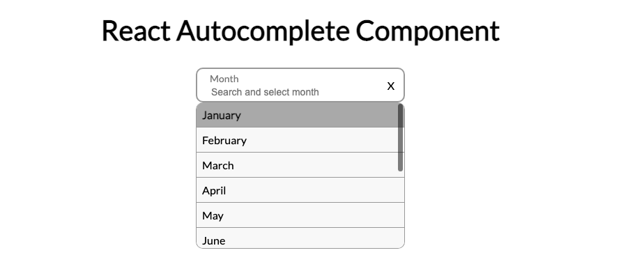
How to Build an Autocomplete Component from Scratch React JS
After searching repeatedly online for an auto complete component without finding any solution to fit my criteria I decided to build my own Auto complete component.
The Problem
Many autocomplete components I found online would either address desktop or mobile, I needed an autocomplete component that could be manipulated by only a keyboard or touch.
Demo Video
Create a React project
Create a new project using the following command in your Terminal.
npx create-react-app react-autocomplete
cd react-autocomplete
npm start
Create a component
We will create a new file “src/components/Autocomplete.js”
We will also create a basic component accepting a parameter for the suggestions to be used within the Autocomplete component and also an input field passed through the parameters
import { useState } from 'react'


const Autocomplete = ({ suggestions, renderInput }) => {
  const [isShow, setIsShow] = useState(false)
  const [active, setActive] = useState(0)
  const [filtered, setFiltered] = useState(suggestions)


  const renderAutocomplete = () => {
    if (isShow && filtered.length > 0) {
      return (
        <ul>
          {filtered.map((suggestion, index) => {
            return (
              <li
                key={index}
                ref={(el) =>
                  index === active &&
                  el !== null &&
                  el.scrollIntoView({
                    behavior: 'smooth',
                    block: 'nearest',
                  })
                }
                onMouseEnter={() => setActive(index)}
              >
                {suggestion}
              </li>
            )
          })}
        </ul>
      )
    } else if (isShow && filtered.length === 0) {
      return (
        <div>
          <em>Not found</em>
        </div>
      )
    }
  }


  return (
    <div>
      {renderAutocomplete()}
      {renderInput()}
    </div>
  )
}


export default Autocomplete
We start by initialing all the states that will be utilized for the component. The states used will consist of
Showing the dropdown component
Which element is currently active in the dropdown
Results of filtering the suggestions based off the value inputted
Next Lets Update our App.js to view the Autocomplete component
import Autocomplete from './components/Autocomplete
import { useState } from 'react'


const months = [
  'January',
  'February',
  'March',
  'April',
  'May',
  'June',
  'July',
  'August',
  'September',
  'October',
  'November',
  'December',
]
const App = () => {
  const [value, setValue] = useState('')


  return (
    <div
    >
      <Autocomplete
        suggestions={months}
        renderInput={(params) => (
          <input
            {...params}
            type='text'
            value={value}
          />
        )}
      />
    </div>
  )
}


export default App
Here we pass the parameters we created earlier which is the suggestions to use with the autocomplete component and the input field to be used.
We need to update our Autocomplete component to accept an input and to filter the suggestions based off changes to the value in the input field and handle state changes
Recommended by LinkedIn
  const stateChange = (input, isShow, active) =>
    setFiltered(
      suggestions.filter(
        (suggestion) =>
          suggestion.toLowerCase().indexOf(input.toLowerCase()) > -1
      )
    )
    setActive(active)
    setIsShow(isShow)
    output(input)
  }

{
We will also be using useRef to reference the autocomplete drop down and the input field to view when clicks occur outside the component to close the drop down list
  const inputRef = useRef(null
  const containerRef = useRef(null)


  useEffect(() => {
    const handleOutsideClick = (event) => {
      if (inputRef.current && !inputRef.current.contains(event.target)) {
        setIsShow(false)
      }
    })
Now lets take care of the input value changing and update the output
  const handleClick = () =>
    setIsShow(true)
  }


  const handleClickSuggestion = (e) => {
    const input = e.currentTarget.innerText
    stateChange(input, false, 0)
  }


  const handleClear = () => {
    setFiltered(suggestions)
    output('')
  }


  const handleChange = (e) => {
    const input = e.target.value
    const isContained = suggestions.some((element) => {
      return element.toLowerCase() === input.toLowerCase()
    })
    isContained ? stateChange(input, false, 0) : stateChange(input, true, 0)
  }
Next for desktop users lets add functionality to allow users to use there keyboard to navigate the component.
  const handleKeyDown = (e) =>
    const keyCode = e.code
    switch (keyCode) {
      case 'Enter':
        e.preventDefault()
        if (filtered.length !== 0) {
          const input = filtered[active]
          stateChange(input, false, 0)
        }
        break
      case 'ArrowUp':
        setActive(!active ? 0 : active - 1)
        break
      case 'ArrowDown':
        setActive(active + 1 === filtered.length ? active : active +1)
        break
      default:
        break
    }
  }
Lastly lets take care of the click events and passing the params to the input component, also useLayoutEffect is used to match the drop down of the component to the width of the input field.
const renderAutocomplete = () =>
    if (isShow && filtered.length > 0) {
      return (
        <ul className={styles.autocomplete}>
          {filtered.map((suggestion, index) => {
            return (
              <li
                className={index === active ? styles.active : ''}
                key={index}
                onClick={handleClickSuggestion}
                ref={(el) =>
                  index === active &&
                  el !== null &&
                  el.scrollIntoView({
                    behavior: 'smooth',
                    block: 'nearest',
                  })
                }
                onMouseEnter={() => setActive(index)}
              >
                {suggestion}
              </li>
            )
          })}
        </ul>
      )
    } else if (isShow && filtered.length === 0) {
      return (
        <div className={styles.noAutocomplete}>
          <em className={styles.absolute}>Not found</em>
        </div>
      )
    }
  }


  const params = {
    onChange: handleChange,
    onKeyDown: handleKeyDown,
    onClick: handleClick,
  }


  useLayoutEffect(() => {
    containerRef.current.style.width = `${inputRef.current.offsetWidth}px`
  }, [inputRef])


  return (
    <div className={styles.container} ref={containerRef}>
      {renderInput(params, inputRef)}
      {clearIcon && (
        <span className={styles.clear} onClick={handleClear}>
          X
        </span>
      )}
      {renderAutocomplete()}
    </div>
  )
Autocomplete.js
import { useState, useRef, useEffect, useLayoutEffect } from 'react
import styles from './styles/Autocomplete.module.css'


const Autocomplete = ({ suggestions, output, renderInput, clearIcon }) => {
  const [isShow, setIsShow] = useState(false)
  const [active, setActive] = useState(0)
  const [filtered, setFiltered] = useState(suggestions)
  const inputRef = useRef(null)
  const containerRef = useRef(null)


  useEffect(() => {
    const handleOutsideClick = (event) => {
      if (inputRef.current && !inputRef.current.contains(event.target)) {
        setIsShow(false)
      }
    }
    document.addEventListener('click', handleOutsideClick)
    return () => {
      document.removeEventListener('click', handleOutsideClick)
    }
  }, [])


  const handleChange = (e) => {
    const input = e.target.value
    const isContained = suggestions.some((element) => {
      return element.toLowerCase() === input.toLowerCase()
    })
    isContained ? stateChange(input, false, 0) : stateChange(input, true, 0)
  }


  const handleClick = () => {
    setIsShow(true)
  }


  const handleClickSuggestion = (e) => {
    const input = e.currentTarget.innerText
    stateChange(input, false, 0)
  }


  const handleKeyDown = (e) => {
    const keyCode = e.code
    switch (keyCode) {
      case 'Enter':
        e.preventDefault()
        if (filtered.length !== 0) {
          const input = filtered[active]
          stateChange(input, false, 0)
        }
        break
      case 'ArrowUp':
        setActive(!active ? 0 : active - 1)
        break
      case 'ArrowDown':
        setActive(active + 1 === filtered.length ? active : active + 1)
        break
      default:
        break
    }
  }


  const stateChange = (input, isShow, active) => {
    setFiltered(
      suggestions.filter(
        (suggestion) =>
          suggestion.toLowerCase().indexOf(input.toLowerCase()) > -1
      )
    )
    setActive(active)
    setIsShow(isShow)
    output(input)
  }


  const renderAutocomplete = () => {
    if (isShow && filtered.length > 0) {
      return (
        <ul className={styles.autocomplete}>
          {filtered.map((suggestion, index) => {
            return (
              <li
                className={index === active ? styles.active : ''}
                key={index}
                onClick={handleClickSuggestion}
                ref={(el) =>
                  index === active &&
                  el !== null &&
                  el.scrollIntoView({
                    behavior: 'smooth',
                    block: 'nearest',
                  })
                }
                onMouseEnter={() => setActive(index)}
              >
                {suggestion}
              </li>
            )
          })}
        </ul>
      )
    } else if (isShow && filtered.length === 0) {
      return (
        <div className={styles.noAutocomplete}>
          <em className={styles.absolute}>Not found</em>
        </div>
      )
    }
  }


  const handleClear = () => {
    setFiltered(suggestions)
    output('')
  }


  const params = {
    onChange: handleChange,
    onKeyDown: handleKeyDown,
    onClick: handleClick,
  }


  useLayoutEffect(() => {
    containerRef.current.style.width = `${inputRef.current.offsetWidth}px`
  }, [inputRef])


  return (
    <div className={styles.container} ref={containerRef}>
      {renderInput(params, inputRef)}
      {clearIcon && (
        <span className={styles.clear} onClick={handleClear}>
          X
        </span>
      )}
      {renderAutocomplete()}
    </div>
  )
}


export default Autocomplete
Autocomplete.module.css
.noAutocomplete
  color: #999;
  margin: 8px;
}


.container {
  position: relative;
}


.clear {
  position: absolute;
  width: 30px;
  height: 100%;
  top: 0;
  right: 0;
  display: flex;
  align-items: center;
  justify-content: center;
  cursor: pointer;
  color: darkgray;
}


.absolute {
  position: absolute;
  bottom: -20px;
  color: red;
}


.autocomplete {
  position: absolute;
  border: 1px solid #999;
  border-top-width: 0;
  max-height: 209px;
  overflow-y: auto;
  background-color: #f8f8f8;
  width: 100%;
  border-radius: 10px;
  z-index: 1;
  list-style: none;
  padding: 0;
  margin: 0;
}

.autocomplete li {
  list-style: none;
  padding: 8px;
}

.autocomplete > .active,
.autocomplete li:hover {
  background-color: darkgray;
  cursor: pointer;
  font-weight: 700;
}

.autocomplete li:not(:last-of-type) {
  border-bottom: 1px solid #999;
}
App.js
import Autocomplete from './components/Autocomplete
import { useState } from 'react'


const months = [
  'January',
  'February',
  'March',
  'April',
  'May',
  'June',
  'July',
  'August',
  'September',
  'October',
  'November',
  'December',
]
const App = () => {
  const [value, setValue] = useState('')


  return (
    <div
      style={{ display: 'flex', justifyContent: 'center', marginTop: '300px' }}
    >
      <Autocomplete
        output={(e) => setValue(e)}
        suggestions={months}
        clearIcon={true}
        renderInput={(params, ref) => (
          <input
            {...params}
            ref={ref}
            placeholder={'Search and select month'}
            type='text'
            value={value}
          />
        )}
      />
    </div>
  )
}


export default App
Link to Repo